15 Stunning Power BI Examples to Inspire Your Reports
Contents
Power BI is a highly sought-after business intelligence tool that enables users to design visually appealing and customizable dashboards without the need for programming skills. These can be easily shared with stakeholders.
Developed by Microsoft, Power BI is particularly suitable for those who are familiar with Excel, as it has a similar interface and integrates deeply with it. Additionally, Power BI offers advanced features that enable users to transform and clean data, collaborate on a large scale, and control access rights in detail.
Despite these fantastic features, the most significant value of Power BI lies in its ability to provide a quick overview of all the essential metrics that organizations and teams need to keep track of through. In this article, we will showcase real-world examples of Power BI reports covering various topics to demonstrate its power.
15 Examples of Power BI Dashboard With Data
1. E-commerce Sales Dashboard
The E-commerce Sales Dashboard power BI example is an interactive tool intended for online retailers, which offers a comprehensive view of how different products are performing. It provides a summary of total sales, including the option to display yearly, quarterly, and monthly growth rates.
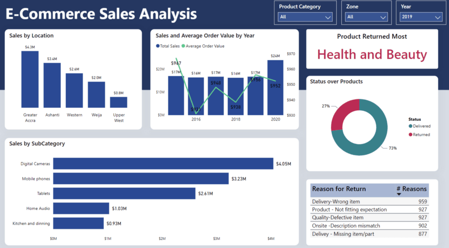
Additionally, the dashboard enables users to explore the data and gain insights into the best-selling products, top-performing locations, and other relevant information. This dashboard provides retailers with both high-level and detailed insights into their sales performance.
The metrics displayed in this dashboard are sourced mainly from Shopify, which is a popular ecommerce platform used by store owners. In addition to tracking total revenue and orders, it is equally important for the seller to monitor health metrics such as Average Order Value and Profit Margin.
Moreover, the seller has incorporated a Profit & Loss statement in their power BI example that outlines different business costs incurred in the previous month. These metrics are not usually tracked in Shopify, but by leveraging a data dashboard, they can be presented alongside the Shopify data, even though they originate from different sources.
Related post: Visual Storytelling with 5 Data Visualization Trends
2. Stock Market Dashboard
The Global Stock Market Dashboard offers a comprehensive view of the top 200 companies in terms of stock price performance during the first year of the Covid-19 pandemic. Many organizations experienced significant losses in the stock market at the outset of the pandemic, but some managed to recover.
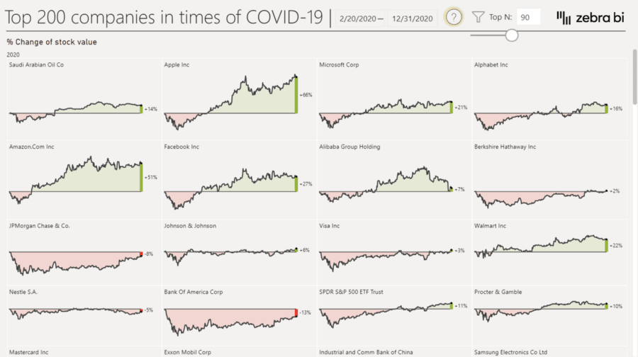
This dashboard provides a useful summary of these companies, utilizing straightforward visualizations and powerful filtering capabilities. The dashboard demonstrates the value of Power BI dashboards in the finance industry.
The trade analysis dashboard is a valuable tool for making decisions based on data. It provides numerous insights into trade and import-export data, highlighting countries with profitable trade and sales.
The dashboard is attractively designed, with multiple filters and an easy-to-read interface. It enhances the power of data storytelling and facilitates a better understanding of data, making it easy to view data in a simple and relevant way.
3. COVID-19 Dashboard
The Covid-19 pandemic has been one of the most significant data stories of the last ten years, and this power BI example provides a compelling example of how data can be used to understand its spread and impact.
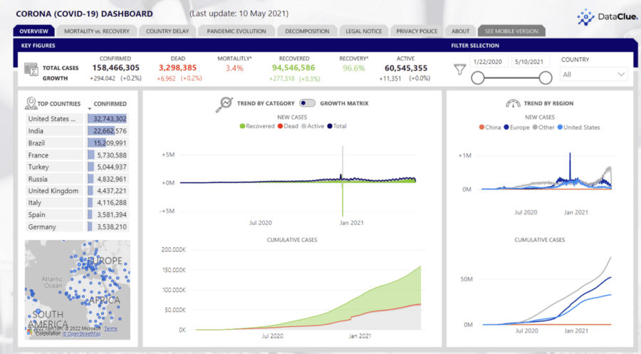
This dashboard allows audiences to gain insights into various aspects of the pandemic, including how it is spreading across countries, recovery and mortality rates, and detailed country comparisons. The dashboard is an effective tool for visualizing complex data related to Covid-19.
With interactive visualizations based on readily accessible data, the Global Covid-19 Analysis Report example of power BI dashboard contributes to fully disclosing COVID-19 trends worldwide. The report includes maps showing Vaccinations, Progress to Zero, Rt, Spread Analysis, Testing, and Risk Levels.
Related post: All about Power BI Developer Salary, Roles, & Responsibilities
4. Construction Permit Data Analysis
The aim of this power BI sample dashboard is to assist construction companies in gaining a deeper understanding of the industry by providing them with more detailed insights and research on relevant incidents.
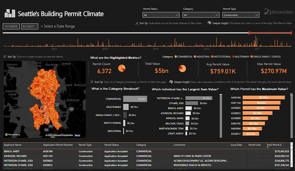
The power BI sample dashboard can focus on various details, such as investment growth over time, investment concentrations in specific areas, and whether investments are impacted by Category, Contractor, or Individual.
To accomplish this project, the Seattle building permits dataset from Kaggle can be utilized, and Power BI data visualization can be applied. The project can include regional maps, pie charts, bar charts, tables, and cards for the main page, as well as bar charts and line charts for depicting contractor competitions and category-wise growth.
This approach can enable a more comprehensive and insightful analysis of the Seattle building permits data. It can also explore market status and identify which categories, individuals, and permits are driving the market.
Related post: AWS Cloud Pricing Calculator Guide
5. Twitter Analysis Dashboard
The objective of this power BI report example is to establish a complete pipeline for Twitter data analysis. The Twitter data available on Github will be utilized for this Power BI project idea. The data will first be extracted and then transformed from JSON to CSV format, with all the required attributes generated.
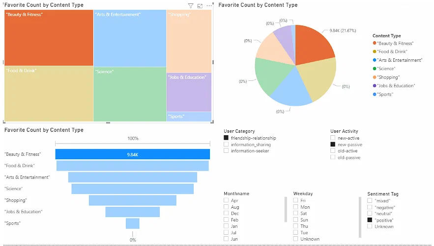
The tweets’ content will be classified, and the sentiment score will be calculated using NLP analysis. Following the ETL process (Extract, Transform, and Load.), the data will be presented using Power BI reports. To build the dashboard, pie charts, bar graphs, line charts, tree maps, and doughnut charts will be employed.
6. CEO Dashboard
This power BI dashboard examples with data is a great example of a powerful tool for CEOs who want a comprehensive view of important KPIs and metrics. It provides valuable insights into the organization’s performance and helps executives make informed decisions and plan strategically for the future.
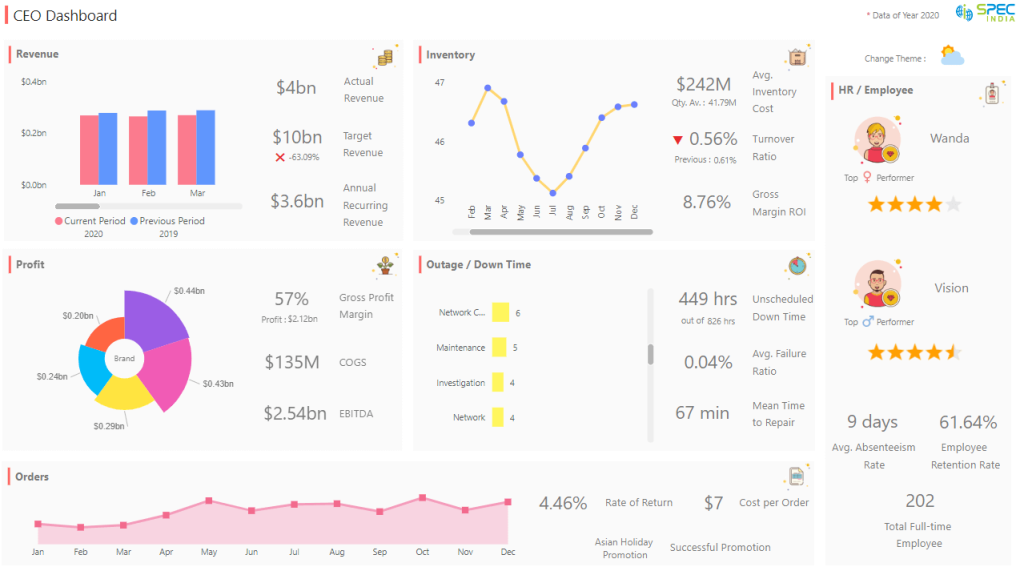
This dashboard provides a high-level overview of key business areas such as inventory, profit, revenue, performance, orders, top employees, and outages. It shows month-by-month performance, orders, full-time employees, gross profit margin, actual revenue, target revenue, average failure ratio, unscheduled downtime, return and cost values, and inventory stats.
This power BI visualisation examples is a perfect example of how Power BI dashboards can provide CEOs and other top executives with a 360-degree view of business activities, enabling them to identify opportunities, trends, and areas for improvement.
7. Time Tracking Dashboard
This power BI dashboard example with data is designed to provide a convenient and straightforward way to track employees’ time and present a summary of their productivity, application usage, tasks, and activity intervals throughout the day or over a specific period.
The dashboard is user-friendly and helps business owners, managers, HR personnel, and team leaders monitor employee’s time effectively. The visualized data makes it easier for top managers to make informed decisions quickly, enhance performance, and optimize delivery processes.
8. Pharmaceutical Company Dashboard
This Power BI dashboard example demonstrates the status of key performance indicators (KPIs) of pharmaceutical companies. It is designed for executives and managers to track sales trends and performance against set targets.
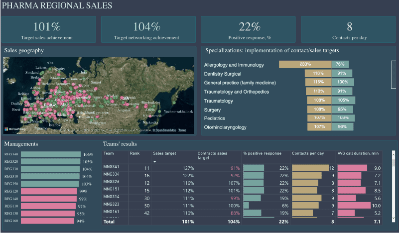
The dashboard presents all necessary data on a single page, with clear and concise visuals. By selecting a specific city, the user can view regional sales performance, team results, networking targets, and the percentage of positive responses, as well as the number of contracts per day.
A bar chart and matrix display the results of each department and sales manager. It is particularly useful for pharmaceutical companies with distributed offices across the world, where sales managers interact with local pharmacists to promote their brand.
9. Financial Analytics Dashboard
This Power BI dashboard is a great example of a tool that can be used to track your finances and provide an overview of your total income and expenses. With this financial analytics dashboard, you can access important key performance indicators (KPIs) that will help you make data-driven decisions.
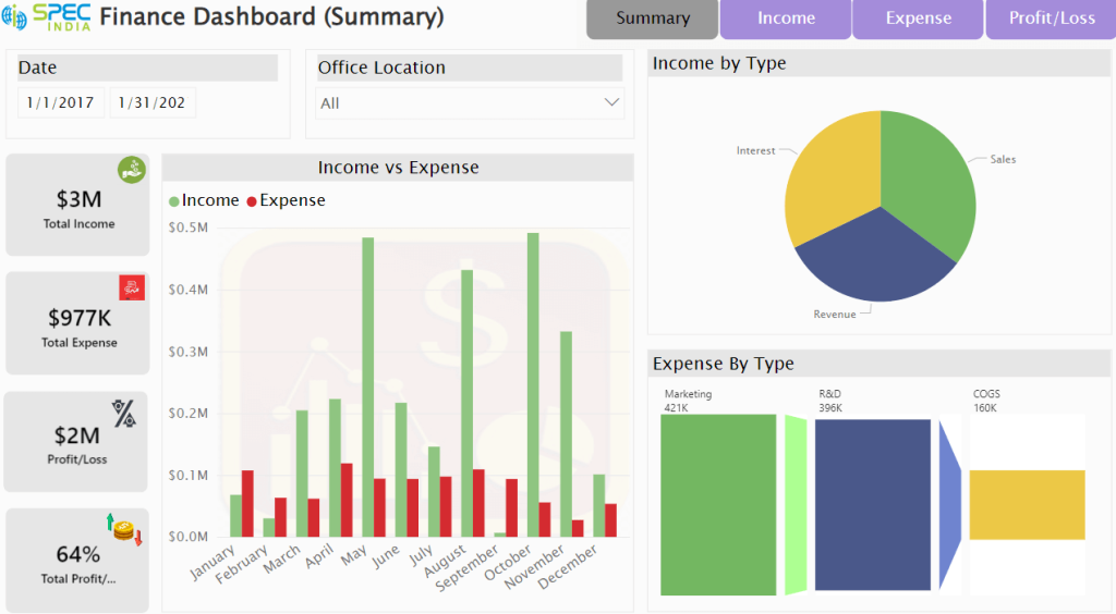
The dashboard displays income information by month, location, and time range, as well as total revenue, sales, and expense details categorized by department, month, and period. Additionally, it offers a bar chart that provides an overall comparison of income versus expenditure.
This dashboard is particularly useful for store owners who manage multiple stores in various locations such as airports, bus stops, plazas, and malls.
10. Attendance Tracker Dashboard
This example of Power BI dashboard is designed to help educational institutions track student attendance and identify areas for improvement to increase engagement. It presents a clear and elegant format that transforms raw data into information with numerous data points from various classrooms, teachers, and schools.
The dashboard is simple yet rich and offers a district-wise overview of attendance status, absence percentage by subject/faculty, school opportunities (important schools to work with), and conversation topics (detailed data on teachers, course, period, and day of the week).
The district status report provides attendance trends and goals, and it also displays predicted data for the upcoming month. The primary objective of this data visualization is to provide administrators with a high-level understanding of engagement among administrators, teachers, and students.
11. Patient Management Analytics Dashboard
This patient management power BI report example is a great example of how Power BI dashboards can provide real-time metrics to support data-driven decision making. It contains all the necessary KPIs and metrics to manage patient care.
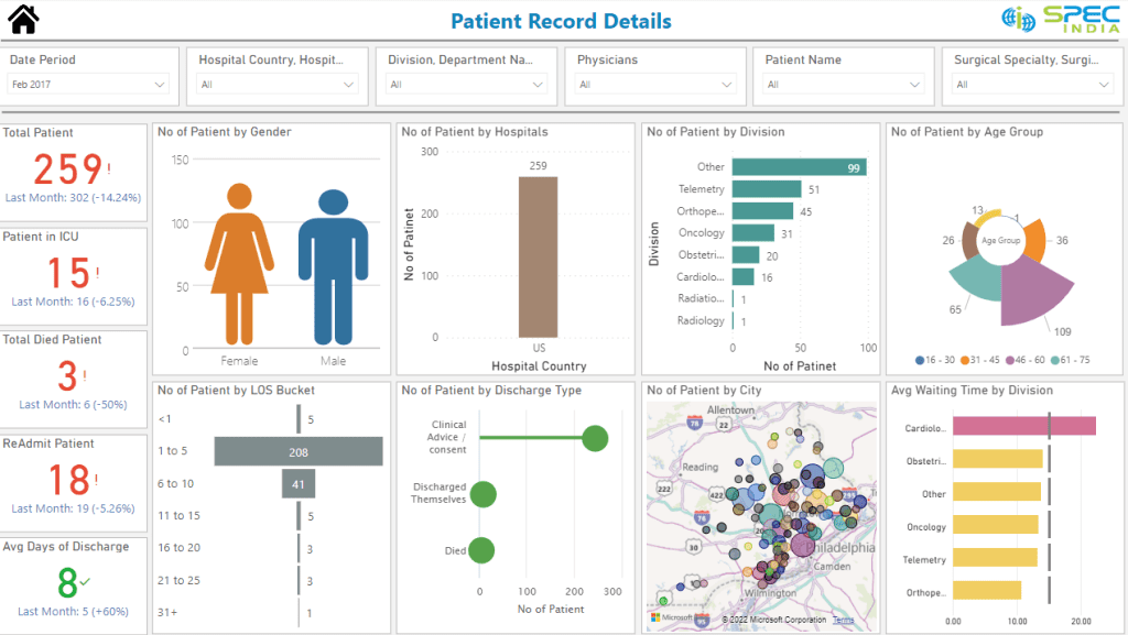
This highly informative and interactive dashboard presents critical data such as the total number of patients, patients in ICU, physicians, departments, location (country, state, and city), patients who died, readmitted patients, and average days of discharge.
This example also displays the average waiting times to identify departments with higher traffic and the ideal waiting times. Additionally, it provides information on the number of patients by LOS Bucket, patients by hospitals, age group, and discharge type.
This dashboard is ideal for multi-specialty hospitals or hospital chains that manage various departments in different locations.
The patient management dashboard is designed to help administrators make informed decisions and proactively identify critical trends and patterns from the data.
12. Mall Analysis Dashboard
This Power BI visualisation examples is ideal for shopping centers, malls, plazas, and arcades that have multiple stores and outlets. It provides a quick view of customer visits and sales made by different stores and allows users to see data by categories such as footwear, clothes, and groceries. Users can compare current and previous months and analyze against targeted goals.
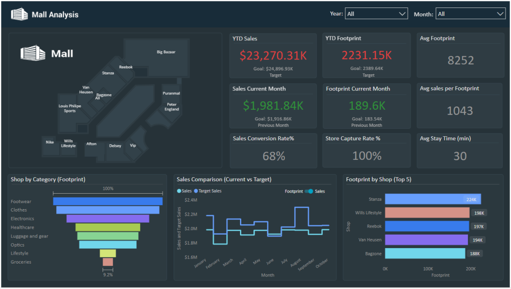
By clicking on the stores in the top left corner, users can view data for a specific store. The mall analysis dashboard also displays the top five stores with the most customer visits and sales.
This dashboard enables users to make informed marketing decisions based on customer behavior and interests. It provides insights into foot traffic and potential buyers of the mall.
13. Property Developer Sales Analytics Dashboard
This example of power BI dashboard is designed to provide a comprehensive overview of real estate sales analytics. The dashboard is divided into three main sections, which are the main dashboard, the sales team dashboard, and the call center dashboard.
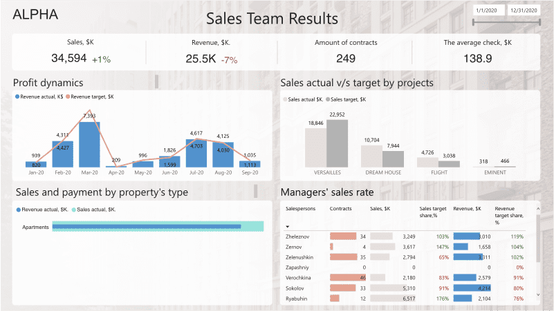
The main dashboard provides details on total sales by project, as well as finance and marketing information. The sales team dashboard shows the effectiveness of the team’s cold calls by displaying the conversion rate, average call and visit frequency, and manager’s performance.
Actual and target sales comparisons and conversion rates from calls to deals are also presented. The final page of the dashboard shows sales details and profit dynamics by month, along with a comparison of actual and target sales.
The dashboard also includes visuals that show revenue by property type and a tile that displays the manager’s sales rate. It is an essential tool for businesses that manage real estate and other types of property.
14. Retail Dashboard
Retailers can leverage data visualization to make data-driven decisions and grow their eCommerce businesses. A comprehensive retail analytics dashboard is a popular example of Power BI dashboards that provides a 360-degree view of retail metrics.
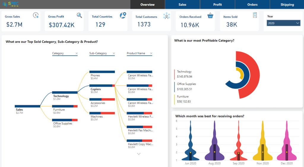
The dashboard features a clean, elegant, and well-designed template that offers the best data visualization experience. Moreover, the Power BI display provides access to all essential information such as gross sales, profit, countries served, items sold, and the best month for receiving orders.
This retail Power BI dashboard includes five pages, starting with an overview, followed by four important metrics: sales, profits, orders, and shipping. It covers all-inclusive KPIs and also offers Power BI row-level security features to control access and implement restrictions based on user authentication and roles.
One of the highlights of this dashboard is its ability to show the top sold category, sub-category, and product. It is useful for directors, sales managers, leaders, retail managers, and anyone involved in planning and strategic decision-making that can contribute to growth.
15. Call Center KPI Dashboard
An example of power BI dashboard for call centers presents important performance metrics and KPIs that enable managers to monitor and optimize operations. It presents data in easy-to-understand visual formats that allow managers and authorized personnel to track the performance of each agent.
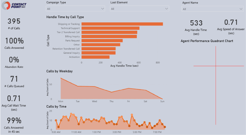
This call center analysis dashboard displays key indicators such as the number of calls, abandon rate, queued calls, average call wait time, and time taken to answer calls. Additionally, it provides insights into the performance of individual agents, campaign types, call types, the last element of calls, calls by weekday, and time.
This type of dashboard is an excellent example of how Power BI can be utilized to meet various data visualization requirements.
Rikkeisoft – An Experienced Power BI Service Provider
Thanks to our expertise in providing end-to-end business intelligence solutions that cater to the client’s specific needs, we believe we can be an experienced Power BI Service Provider. We have a team of certified Power BI developers who possess vast experience in developing visually appealing and interactive Power BI dashboards.
We have successfully completed various Power BI projects for clients across various domains such as retail, healthcare, finance, and manufacturing.
As a bonus, we offer a complete suite of Power BI services, including consulting, data modeling, dashboard design, and implementation. Additionally, our strong focus on client satisfaction and quality assurance ensures that their clients receive the best possible solution.

More From Blog
March 13, 2026
BFSI: Modernizing Core Banking Systems Without Disrupting Operations
Digital banking appears sophisticated on the surface. Customers transfer money in seconds, open accounts remotely, and receive real-time notifications. Yet beneath these seamless experiences, many banks still operate on infrastructure designed decades ago. According to Boston Consulting Group’s June 2025 report, between 90 and 95 percent of banks in the Southeast Asia region still operate […]

October 28, 2025
Australia’s Fintech Revolution: Trends Shaping the Future of Digital Finance
Australia has emerged as one of the most dynamic fintech hubs in the Asia-Pacific region, driven by strong consumer demand for digital financial services, supportive government regulations, and the widespread adoption of innovative technologies. As the industry matures, the imperative for digital transformation has become unmistakable: fintechs and financial institutions alike are under pressure to […]
August 12, 2025
AI and Big Data in Building Smart Insurance Platforms
The insurance industry is now standing at a pivotal moment in its digital evolution. Traditional insurance models built on historical data analysis and reactive risk assessment are rapidly giving way to intelligent, predictive platforms powered by artificial intelligence and big data analytics. This transformation represents more than technological modernization; it’s a fundamental reimagining of how […]

July 23, 2025
Insurtech’s Game-Changing Trends: How AI and Digital Transformation Are Reshaping Insurance
The financial technology sector is experiencing unprecedented change, making it essential for business leaders and technology professionals to stay ahead of emerging innovations. Throughout 2025, insurance technology (insurtech) has emerged as a powerful catalyst for change, fundamentally altering how insurance providers conduct business, engage with clients, and assess risks. This technological evolution represents more than […]
April 4, 2024
Big Data Performance: Maximize Your Business Value
In today’s data-driven world, organizations are constantly generating and collecting immense amounts of data to understand their customers more deeply. This data, often referred to as “big data,” holds immense potential for organizations to seek opportunities and overcome challenges. But accessing and analyzing big data isn’t enough to have proper strategies; organizations must pay attention to […]

April 4, 2024
How Real-Time Data Analysis Empowers Your Business
In today’s fast-paced business landscape, the ability to quickly make data-driven decisions has become a key differentiator for success. Real-time data analysis, the process of analyzing data as soon as it’s generated, has emerged as a powerful tool to empower business across industries. By leveraging real-time data analysis, organizations can gain timely and actionable insights, […]