Visual Storytelling with 5 Data Visualization Trends
Contents
In today’s fast-paced world, data visualization has become a crucial tool for businesses, journalists, and researchers to convey complex information in a simple and effective way through the latest data visualization trends. With the growing need to make sense of large datasets, visual storytelling has emerged as a powerful technique to communicate insights and engage audiences.
From interactive dashboards to animated videos, there are various data visualization trends that are transforming the way we tell stories with data. In this article, we will explore five of the latest trends in visual storytelling and their potential impact on how we understand and interpret information.
Whether you are a data analyst, a journalist, or simply someone interested in data-driven narratives, this article will provide you with valuable insights into the exciting world of data visualization.
What Is Data Visualization?
Data visualization is a technique that has become increasingly popular in recent years, as more and more organizations have started to recognize the importance of data-driven decision making. With the rise of big data and the increasing complexity of business operations, it has become essential to have an effective way to analyze and interpret data.
Data visualization is a powerful tool for achieving this, allowing users to create visual representations of complex data sets in a way that is easy to understand and interpret.
There are many different types of data visualization, each with its own strengths and weaknesses.These visualizations is designed to highlight different aspects of the data, such as trends over time, comparisons between different variables, or spatial relationships.
Main Benefits of Data Visualization
One of the main benefits of data visualization is that it enables users to quickly identify patterns and trends in data that may be difficult to discern through other means. By identifying these patterns, users can gain insights that might have otherwise been missed, allowing them to make more informed decisions based on the data.
Another key advantage of data visualization is that it allows users to communicate complex data in a way that is easy to understand and digest. This is particularly important when presenting data to non-experts or stakeholders who may not have a strong background in data analysis. By using visualizations that are intuitive and easy to interpret, users can help to ensure that their message is understood and that their recommendations are acted upon.
Top 5 Data Visualization Trends
1. Real-time data visualization
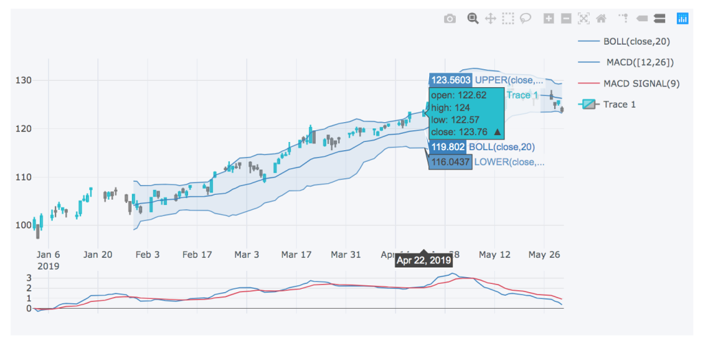
Real-time data visualization is one of the emerging data visualization trends that is gaining popularity across various industries. It refers to the ability to mark a problem or opportunity the moment it arises, enabling companies to make informed decisions faster and more efficiently. Early detection of issues in business strategies, customer retention, and regular brand presence can significantly impact a company’s bottom line. According to a recent survey by DataStax, 78% of participants consider real-time data a “must-have,” and 71% believe that revenue growth is directly influenced by real-time data.
Organizations that utilize real-time data visualization gain a competitive advantage. They can manage risks more efficiently, recognize emerging opportunities earlier, and make strategic decisions quicker. Additionally, businesses can design dashboards that combine real-time data with historical data, providing even more powerful analysis. Real-time visualization is particularly critical in industries like logistics and shipping, where combining real-time data from multiple sources can determine current locations, expected delivery times, and potential problems associated with shipments.
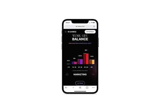
Real-time data visualization is not limited to businesses and is becoming increasingly popular among the general public. FlightRadar24, for instance, utilizes over 20,000 specialized radar receivers and data feeds worldwide to track millions of aircraft positions per day, providing data that is useful for commercial applications in the aviation, insurance, and asset management industries.
Data visualization can even aid autistic students in navigating a college campus. IoT sensors, environmental sensors, and digital crowd counting data feed into the platform, creating a real-time picture of sensory hot spots on campus, which can be accessed on students’ mobile devices. Autistic students often face challenges in navigating a college campus due to sensory overload, difficulty with spatial awareness, and anxiety caused by unexpected changes in their routine. Data visualization tools can assist these students by providing them with real-time information about the sensory environment on campus.
Using IoT sensors and environmental sensors, the platform can detect sensory hot spots such as loud areas, crowded areas, or places with strong smells. This data can be visualized on students’ mobile devices in the form of a map or dashboard, allowing them to plan their route and avoid triggering sensory experiences. Moreover, by using digital crowd counting data, the platform can provide students with information on the busiest times and locations on campus, enabling them to plan their activities accordingly. By leveraging the power of data visualization, colleges and universities can create a more inclusive and accessible environment for all students, including those with autism.
Real-time data visualization is one of many significant trends in data visualization in 2023 that has the potential to revolutionize decision-making across various industries. It enables organizations to gain insights into data in real-time, make informed decisions quickly, and gain a competitive edge. Furthermore, real-time data visualization is no longer limited to businesses, and its benefits can be seen across a wide range of sectors, including education and transportation.
2. Video visualization
Video visualization is also one of the best growing data visualization trends in 2023, with a recent study revealing that 67% of users prefer to learn about a new product or service via a video rather than text or images. The statistics for data retention through video are even more impressive than those for static visuals. Our brains are naturally inclined to pay attention to videos, even with less appealing content such as a presentation. The emotional impact of a creative commercial or the attractive capacity of a music video are well-known, but even simple videos can capture our attention better than other forms of media.
In addition to being more engaging, videos are also more effective for learning and retention.The same study found that participants who received a video aid answered questions 323% better than those who had a text guide only. These factors make video infographics and commercials highly promising tools for customer retention and business strategy. While their application is still being explored, video visualization has the potential to revolutionize data visualization in the years to come.
3. Data democratization
Data democratization refers to the practice of granting access to data to all users. Google’s search volume for “data democratization” has increased by 1,400% since 2018, indicating the growing importance of this concept. With data democratization, IT departments do not need to be involved in every data-related task in a company, and users throughout the organization can access data, perform analyses, and create data visualizations independently. This access to data empowers employees to make informed business decisions and communicate them to company leadership through visualizations.
A survey of 500 business leaders found that 90% consider data democratization a priority for their business. To enable employees to create their data analyses and visualizations, no-code/low-code solutions play a crucial role. These solutions allow users with little to no coding experience to create customized data experiences. Opendatasoft is a company that provides a no-code data experience platform to businesses worldwide. It collects data from various sources, organizes it, and enables users to create visualizations for internal and external use.
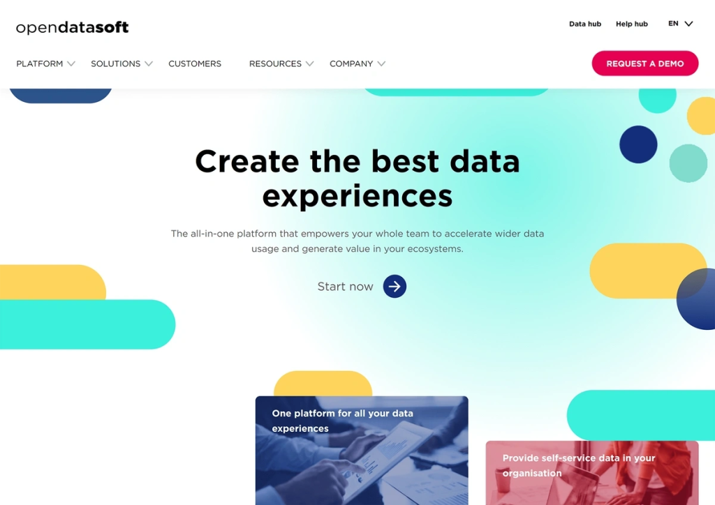
Opendatasoft provides responsive data visualizations that allow users to analyze data more effectively which is amongst one of the most amazing trends in data visualization. The city of Geelong, Australia, is an example of a place that used the Opendatasoft platform to create a data analysis and visualization platform accessible to all citizens and businesses. This platform collects data on weather, animal migration, tree removal, parking lot occupancy, and other metrics. The data exchange has a page dedicated to counting Wi-Fi devices in the city, which displays a map, counters, bar graphs, and other visualizations that can be customized by location and date. Data democratization is also allowing ordinary citizens to analyze data and create visuals that were previously unavailable to them.
4. AI and machine learning data visualization
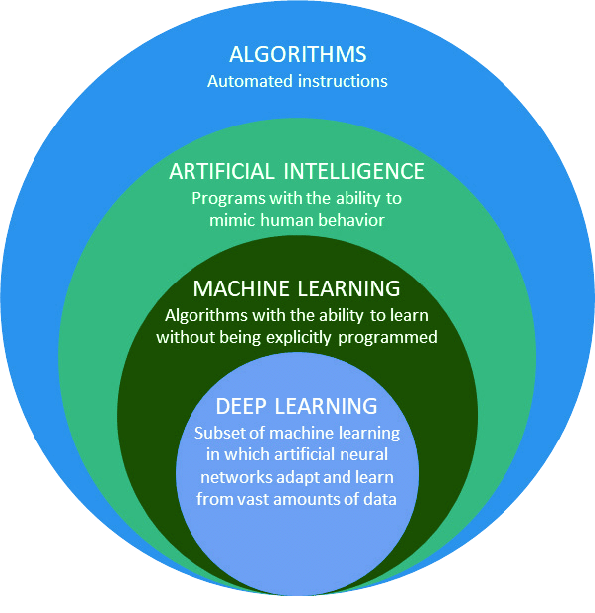
One of the top trends in data visualization for the foreseeable future is the integration of AI and machine learning. These technologies will continue to play a critical role in developing high-quality data visualizations. Without them, data visualization efforts may prove to be inaccurate and ineffective in the long run. This is due to the fact that humans are not always efficient at categorizing raw data. Therefore, relying solely on human analysis can create biased views and results.
With the help of AI, businesses can accurately categorize data, especially customer feedback, in real-time and according to specific requirements. This eliminates the need for employees to perform tedious tasks, such as hand-tabulating data for countless hours, which often leads to bias and errors. By automating this process with AI, businesses can receive unbiased and accurate feedback, which can be used to make informed decisions.
Moreover, AI can help businesses to identify data visualization trends, which are not easily recognizable by humans. With these insights, businesses can create more effective data visualizations that can provide valuable insights into their operations. Additionally, AI can be used to develop predictive models that can help businesses to anticipate future trends and adapt accordingly.
As technology continues to evolve, AI and machine learning will undoubtedly remain an essential part of data visualization. Businesses that adopt these technologies will be better equipped to make data-driven decisions that can lead to improved outcomes.
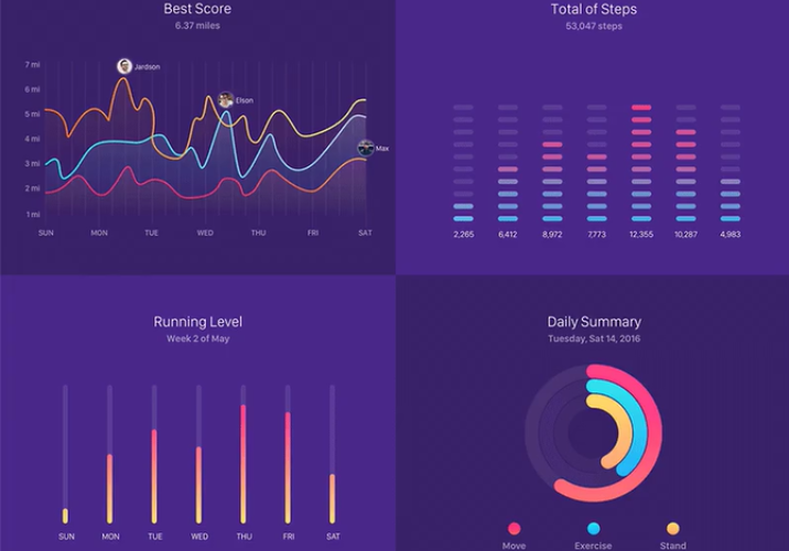
5. Mobile-friendly Visualizations
The constantly evolving way in which people access the internet has a significant impact on data visualization trends. A recent study by Broadband Search in February 2021 revealed that mobile devices accounted for 56% of internet access, making it a massive market share. It is crucial to recognize that data visualization is not limited to in-house teams, as it can be used to reduce customer churn, enhance customer loyalty, and attract new customers. Visualizations have tremendous power, and businesses need to harness this power to achieve their goals.
In 2023, the trend for mobile and social visualization will continue to grow. Whether it is existing or potential customers keeping up with your company’s offerings on social media, your website, or an online review platform, mobile-compatible data visualization is crucial. If the content is not responsive on mobile devices, it can drive customers away. Additionally, it could mean that they miss out on important graphics that you strategically placed. This can ultimately lead to customer churn, which is undesirable for any business. To stay ahead of the competition, it is crucial to lead the race in mobile data visualization, which is an easy yet critical step.
Rikkeisoft – A Data Analytics Services Provider
Established in 2012, Rikkeisoft is a leading analytics services provider that offers a range of solutions to help businesses make data-driven decisions. With their expertise in data analytics, Rikkeisoft is able to help clients unlock the value hidden in their data and gain insights that can help drive growth and profitability.
As an analytics services provider, Rikkeisoft’s offerings include data visualization, business intelligence, and predictive analytics. They work with clients across a variety of industries, including healthcare, finance, retail, and more, to help them optimize their operations and gain a competitive edge.
One of the key advantages of working with Rikkeisoft is their commitment to staying up-to-date with the latest trends and technologies in the field of data analytics. This enables them to offer cutting-edge solutions that leverage the power of artificial intelligence, machine learning, and other advanced analytics techniques.
Overall, Rikkeisoft’s analytics services are designed to help businesses of all sizes and industries make better decisions based on data-driven insights. Whether it’s optimizing operations, improving customer experience, or identifying new opportunities for growth, Rikkeisoft is dedicated to helping their clients achieve their goals and succeed in today’s data-driven world.
Conclusion
In conclusion, data visualization has become an essential tool for businesses to communicate their insights to a wider audience effectively. With the rise of digital media and the increasing amount of data generated every day, it has become even more critical to adopt the latest data visualization trends to stay ahead in the game. By leveraging these five data visualization trends, businesses can create compelling visual stories that capture the attention of their target audience and drive engagement.
Whether you’re a marketer, data analyst, or business owner, incorporating these trends into your data visualization strategy can help you communicate complex data in a clear, concise, and visually appealing manner. By keeping up with the latest trends and tools, businesses can create impactful visual stories that leave a lasting impression on their audience, enhance their brand image, and achieve their business goals.

More From Blog
March 13, 2026
BFSI: Modernizing Core Banking Systems Without Disrupting Operations
Digital banking appears sophisticated on the surface. Customers transfer money in seconds, open accounts remotely, and receive real-time notifications. Yet beneath these seamless experiences, many banks still operate on infrastructure designed decades ago. According to Boston Consulting Group’s June 2025 report, between 90 and 95 percent of banks in the Southeast Asia region still operate […]

October 28, 2025
Australia’s Fintech Revolution: Trends Shaping the Future of Digital Finance
Australia has emerged as one of the most dynamic fintech hubs in the Asia-Pacific region, driven by strong consumer demand for digital financial services, supportive government regulations, and the widespread adoption of innovative technologies. As the industry matures, the imperative for digital transformation has become unmistakable: fintechs and financial institutions alike are under pressure to […]
August 12, 2025
AI and Big Data in Building Smart Insurance Platforms
The insurance industry is now standing at a pivotal moment in its digital evolution. Traditional insurance models built on historical data analysis and reactive risk assessment are rapidly giving way to intelligent, predictive platforms powered by artificial intelligence and big data analytics. This transformation represents more than technological modernization; it’s a fundamental reimagining of how […]
July 23, 2025
Insurtech’s Game-Changing Trends: How AI and Digital Transformation Are Reshaping Insurance
The financial technology sector is experiencing unprecedented change, making it essential for business leaders and technology professionals to stay ahead of emerging innovations. Throughout 2025, insurance technology (insurtech) has emerged as a powerful catalyst for change, fundamentally altering how insurance providers conduct business, engage with clients, and assess risks. This technological evolution represents more than […]
April 4, 2024
Big Data Performance: Maximize Your Business Value
In today’s data-driven world, organizations are constantly generating and collecting immense amounts of data to understand their customers more deeply. This data, often referred to as “big data,” holds immense potential for organizations to seek opportunities and overcome challenges. But accessing and analyzing big data isn’t enough to have proper strategies; organizations must pay attention to […]
April 4, 2024
How Real-Time Data Analysis Empowers Your Business
In today’s fast-paced business landscape, the ability to quickly make data-driven decisions has become a key differentiator for success. Real-time data analysis, the process of analyzing data as soon as it’s generated, has emerged as a powerful tool to empower business across industries. By leveraging real-time data analysis, organizations can gain timely and actionable insights, […]